Facilitating developer work with Tailwind dimensions in Figma
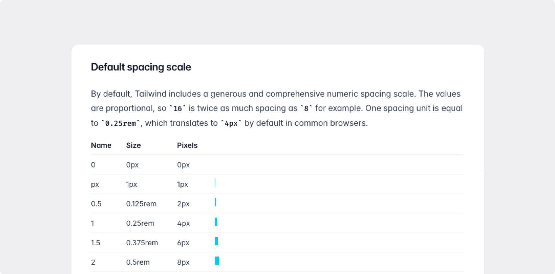
If your project utilizes TailwindCSS, developers use Tailwind dimensions in their
codeFor instance, instead of writing "padding: 32px", they write "p-8". When developers
see any pixel values in Figma, they have to divide it by 4.
Designers should use Tailwind dimensions in Figma too, to avoid developers having to convert
every pixel into Tailwind values.

How to apply Tailwind dimensions in Figma
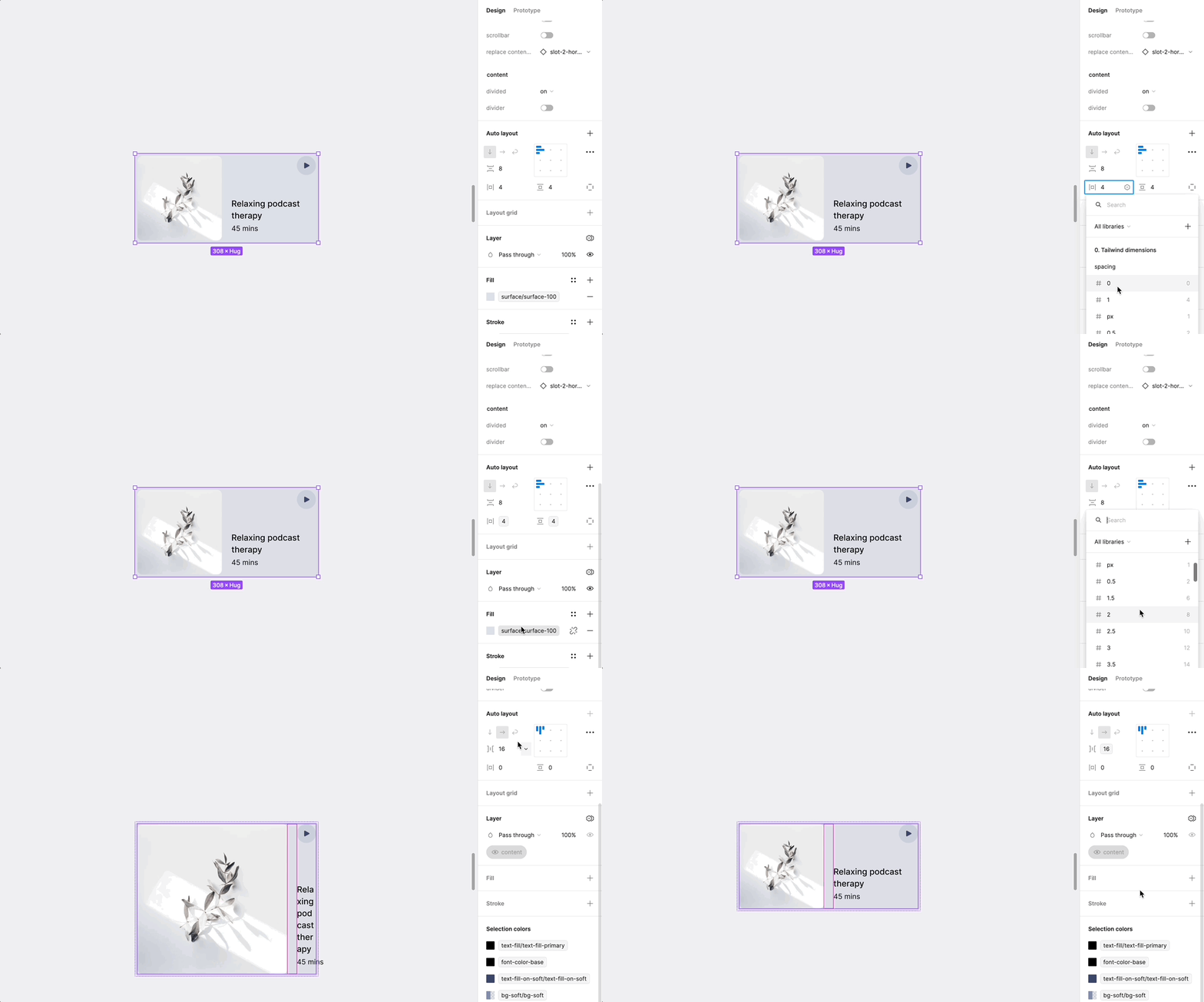
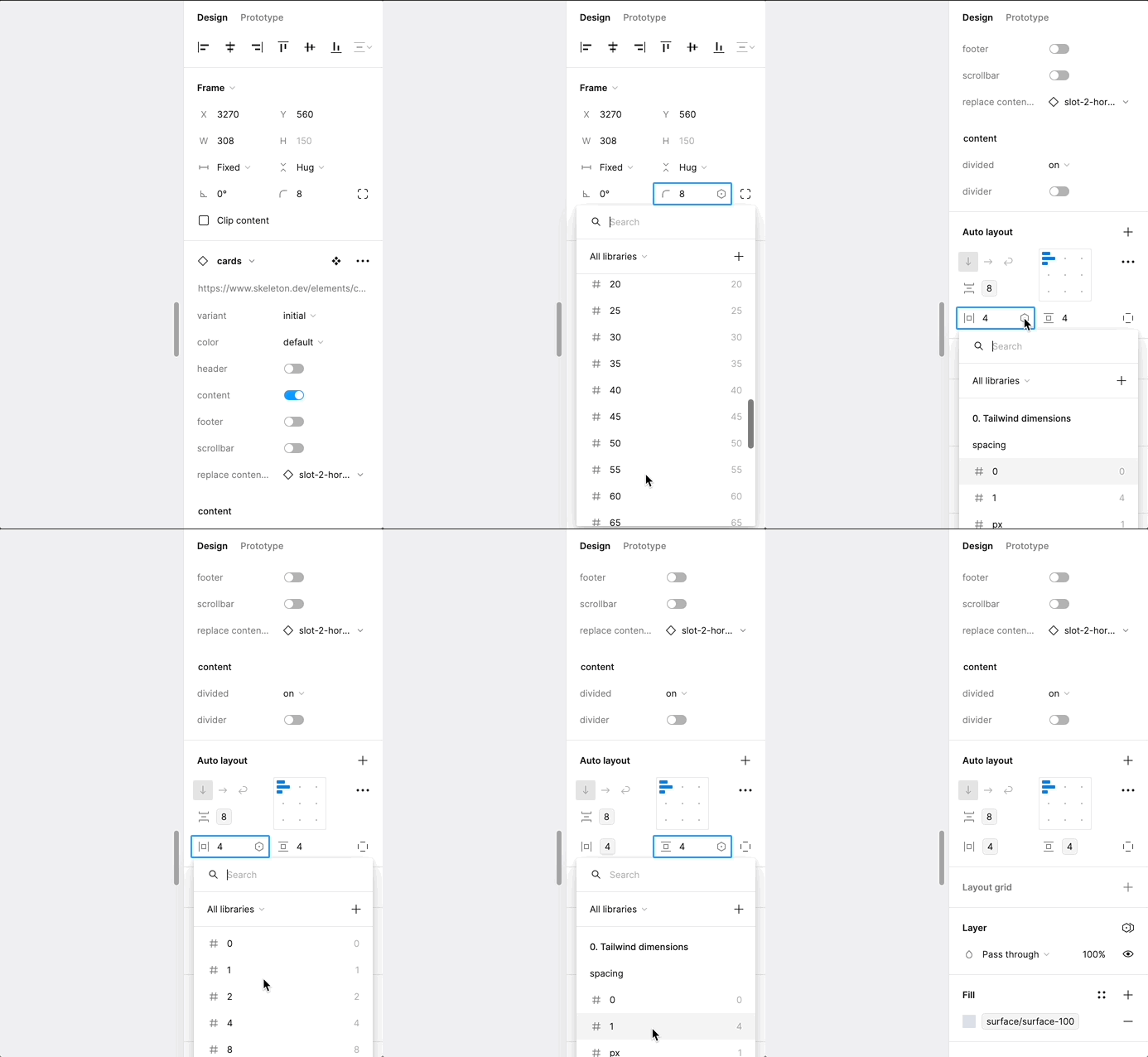
Skeleton Figma Component library includes Tailwind dimensions as Variables.
Below is an example how you can apply Tailwind dimension to Card component.

What developers will see?
When developers are working in ‘DEV mode’ in Figma and hover over an object, they will
see paddings, margins, gaps, and other values displayed as Tailwind values (dimensions).
This means there is no need to manually calculate or convert any values, as developers will
immediately see the values they need to write in their code.

Types of Tailwind dimensions
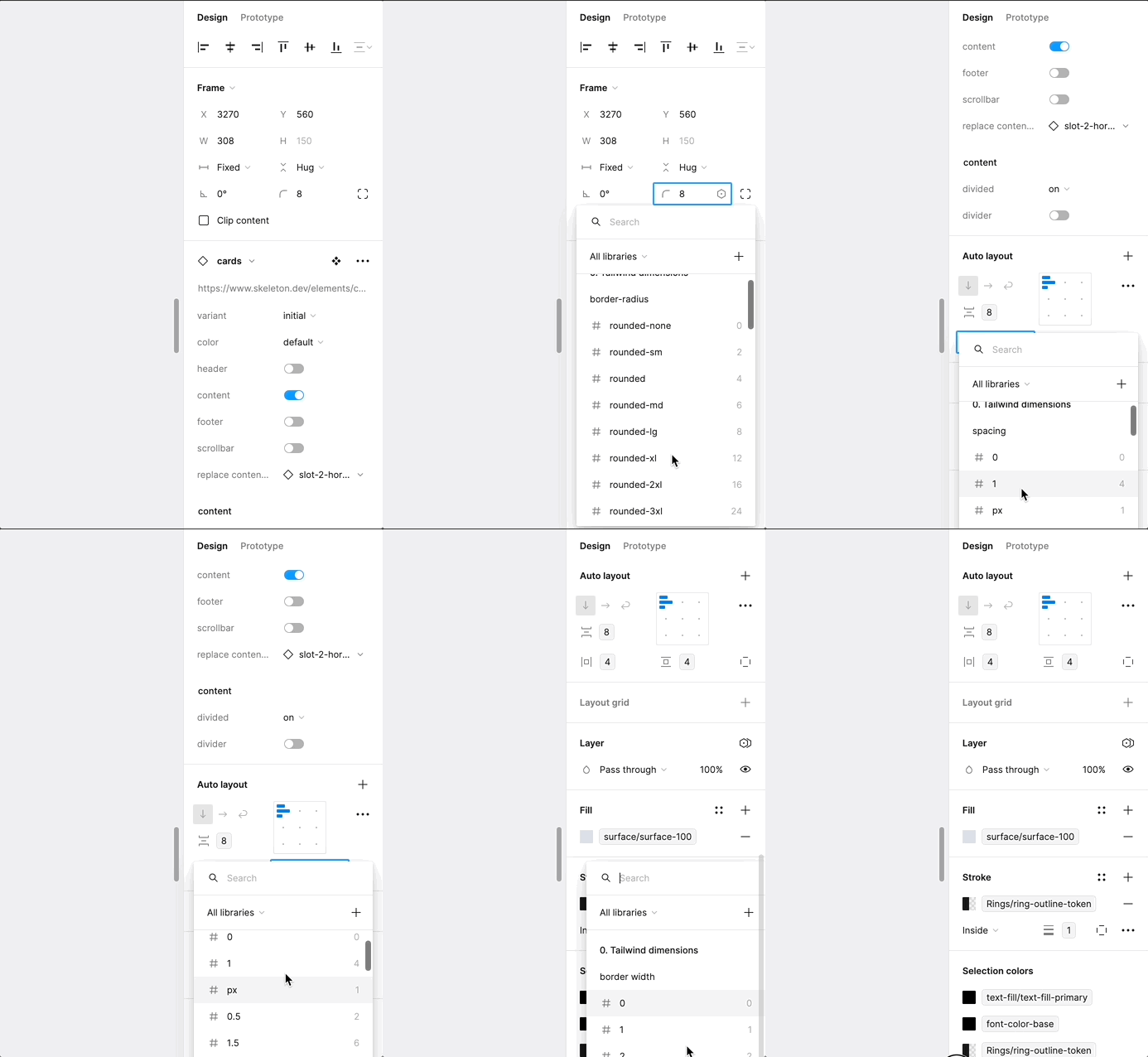
There are different Tailwind dimensions types. Use different dimensions for different
use cases.
For instance, use spacing dimensions for padding, margins, gaps, width, height, and grid
gaps. Use border-radius dimensions only for border-radius, and apply opacity only for opacity,
and so forth.
Don’t apply dimensions to wrong places e.g. opacity dimensions to border-radius or vice-versa

Each dimension type has it place

